34
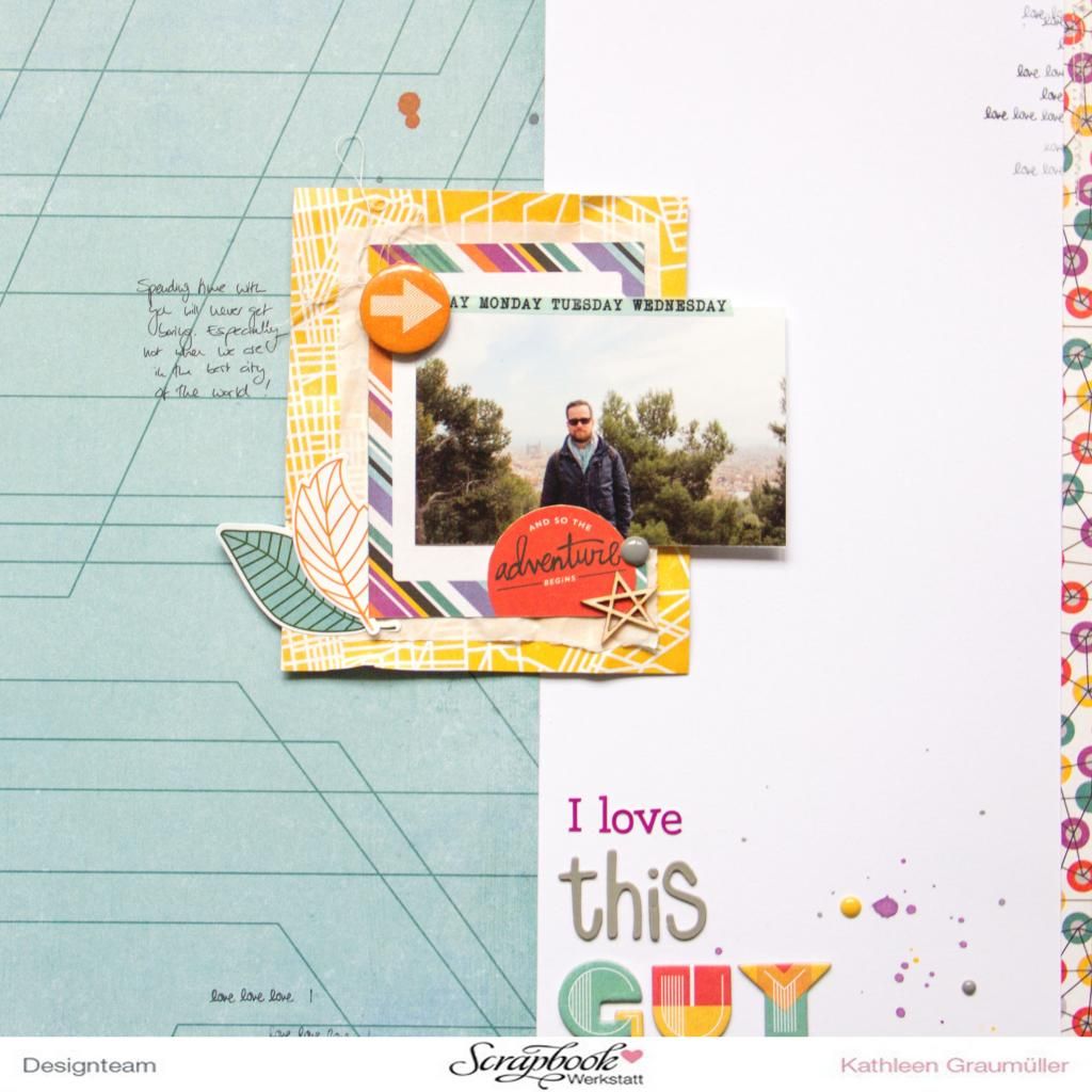
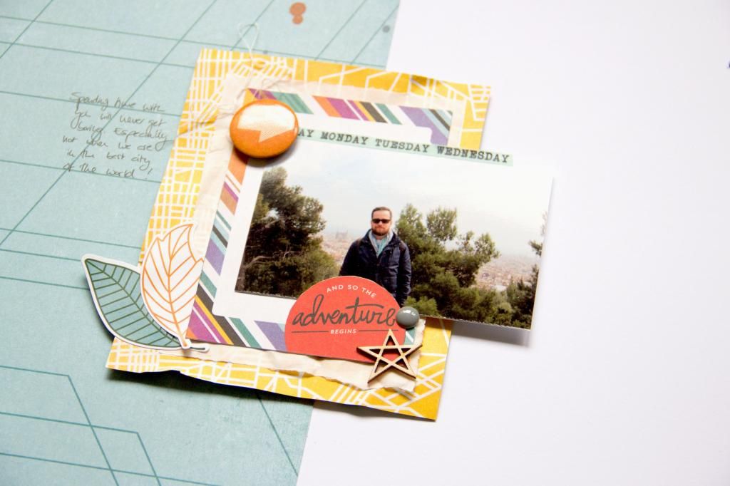
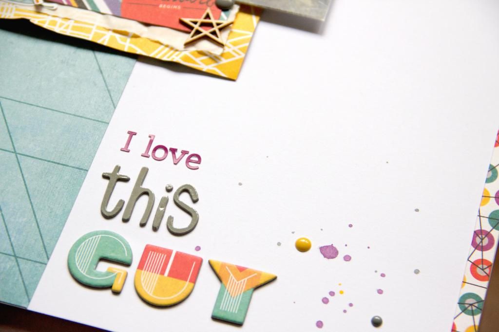
Woohoo, I finally made it: a new blog post that is not about my Get Messy art journal! And not only that, today I will show you two (yeah, you read right, TWO :D) layouts that I've made with the awesome "Second City" collection by Kelly Purkey for Basic Grey. When I first saw this line, I fell in love. It's just different from most other scrapbooking collections out there: the colour scheme, the patterns.. So awesome! But when I finally held it in my hands, I struggled a bit to actually use it. The thing is, on all the layouts I've made so far, I would say the colour purple appears on maybe 1% of them.. And orange is also not a very frequently used colour in my stash, let alone the combination of these two.. So working with this collection was a bit of a challenge for me, but I decided to make it work. And so I did: I made these two layouts, another one that I will share in a few days with a little tutorial idea and two cards - and I am determined to make even more :) This first layout is a classical 12x12. I've been making quite a lot 8.5"x11" layouts in the past few weeks and felt a bit stuck. So I decided to switch things up and go back to the roots ;)
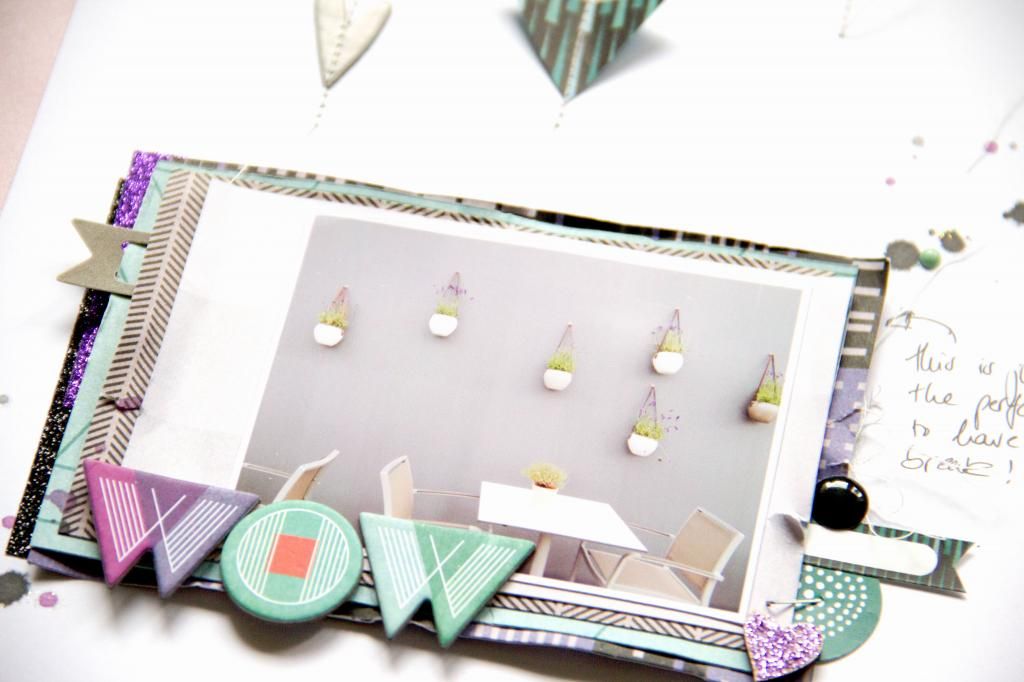
There's not much to say about the LO itself, just one of my favourite photos of one of my favourite people in the world, in my favourite city on earth! :)
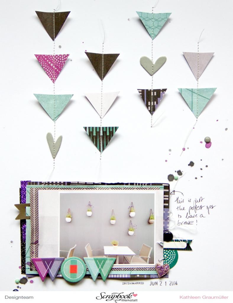
On this second layout I tried to create a different colour scheme. The one in the first layout is quite colourful and bright with all the orange and yellow. Here I tried to keep it to a few less colours to match the photo and the "design-y" feeling of the photo.
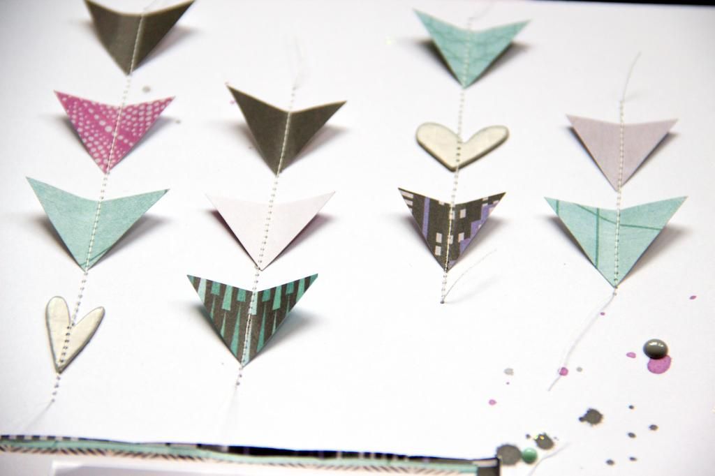
I started with layering some patterned papers underneath the photo and adding a few paint splodges. The layout still felt quite empty but I didn't want to add more colours or patterns to it, so I cut those little triangles out of some papers that matched the colour scheme and used my sewing machine to stitch them on the page. It kinda recreates the look of those hanging planters in the picture, too. :)